- Visual Communications
-

KTC
-

-
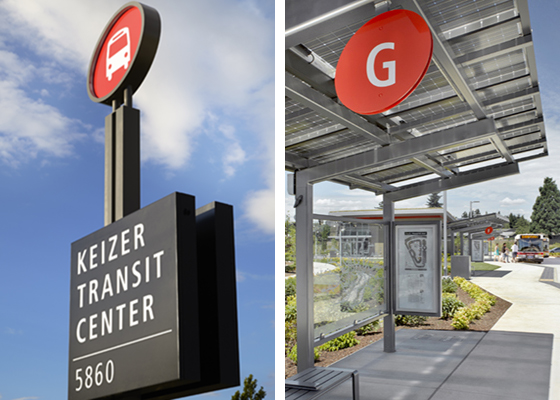
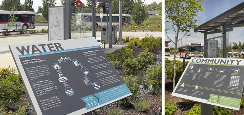
Salem-Keizer Transit built the sustainably designed Keizer Transit Center as an example of the agency’s strategic approach to transit service. Mayer/Reed designed the site identity, building, bus bay and site-specific interpretive signage. The red cherry logo is reimagined for a fresh application of the agency brand on signage. Playful oval sign panels in cherry red are reoccurring graphic elements found throughout the site. Interpretive signs highlight sustainable site elements and promote healthy lifestyle choices to support the project initiatives. Complex information and concepts are presented through clear info-graphics, universal symbols and a high-contrast layout.
Client: Salem-Keizer Transit
Photography: Ken Gutmaker
-

KTC
-

Salem-Keizer Transit built the sustainably designed Keizer Transit Center as an example of the agency’s strategic approach to transit service. Mayer/Reed designed the site identity, building, bus bay and site-specific interpretive signage. The red cherry logo is reimagined for a fresh application of the agency brand on signage. Playful oval sign panels in cherry red are reoccurring graphic elements found throughout the site. Interpretive signs highlight sustainable site elements and promote healthy lifestyle choices to support the project initiatives. Complex information and concepts are presented through clear info-graphics, universal symbols and a high-contrast layout.
Owner
