Mayer/Reed was one of seven design teams invited to participate in a Design Week Portland event hosted by SEGD (Society for Experiential Graphic Design). Each team designed and produced a temporary installation along Lawrence Halprin’s masterpiece, the Portland Open Sequence.
Teams were asked to explore the role of graphic design in public space and consider: Can we inspire, educate, and promote interaction? How does this create a connection to our community and stewardship of our public spaces?
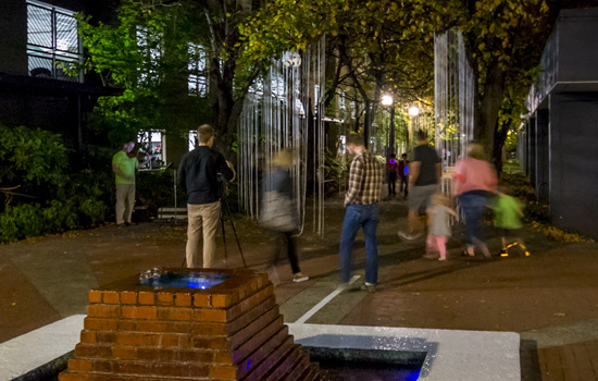
A magical evening transpired. Hundreds of Portlander’s joined us, beginning at Mayer/Reed’s installation “We Are All in This Together” at Keller fountain.
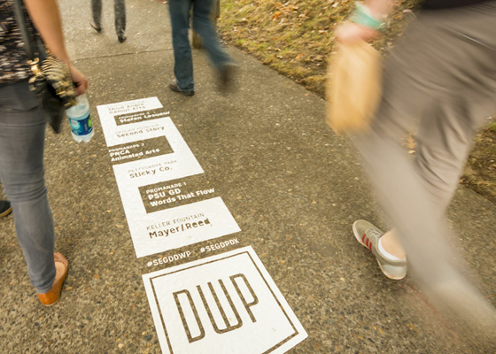
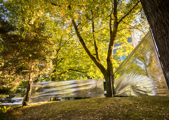
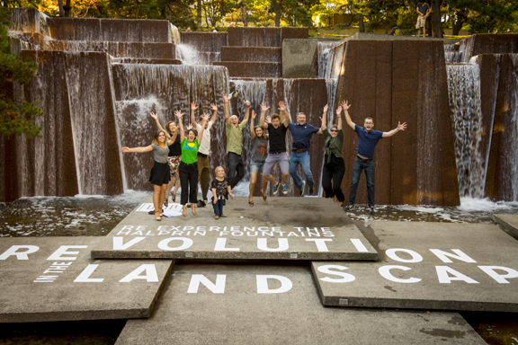 “We Are All in This Together” Designed by Mayer/Reed
As Co-chair of the SEGD Portland Chapter with Mike Sauer, I had the honor of working with all the design teams to see their concepts become reality. My biggest impression of the night was seeing hundreds of people and their “glow” moving through the spaces as we walked toward the Source. It was surreal to see so many people experience the spaces together. Good show Portland, good show!
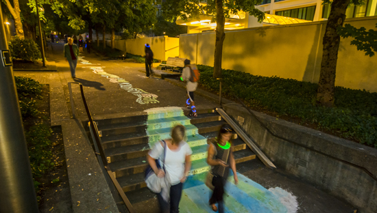 “Words That Flow” Designed by Portland State University, Graphic Design
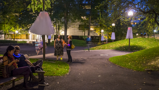 “Dancers in the Park” Designed by Sticky Co.Arts
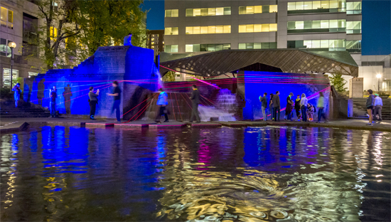
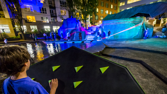 “Perform” Designed by Second Story
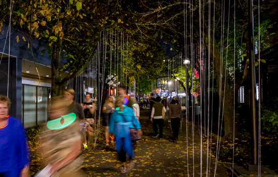 “Urban Nature” Designed by Stefan Lesueur
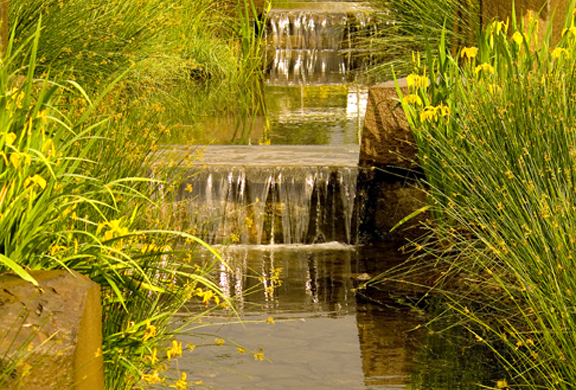
 “Begin/End” Designed by Third Angle New Music and Gamut Arts


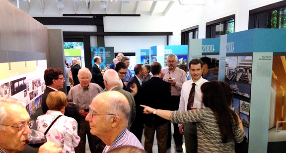
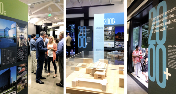 The exhibit runs through Sept 30 at The Center for Architecture, 403 NW 11th Avenue, Portland, OR.